The Marches Delicatessen- Full Brand Campaign
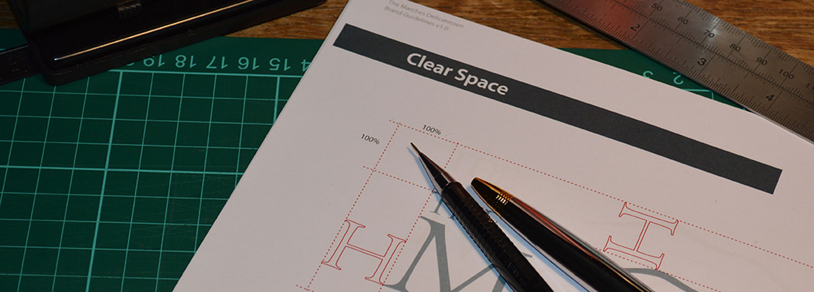
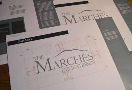
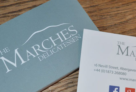
Garcia & Lewis set up their delicatessen in May 2014 with the primary business aim of promoting local (Welsh) artisan food. A number of locations were considered before eventually securing premises in the bustling market town of Abergavenny, Monmouthshire. They approached Tidy Box to create a brand that would resonate with customers and distinguish the business from similar local enterprises. We developed the brand and logo design alongside a strong communications strategy which incorporated advertising, responsive website and social media, shop signage and business stationery, apparel and merchandise.
A range of names and ideas were presented to the company. It was important to develop a name and brand that would reflect the core aim of the business without limiting exposure and growth by being too specific to the locality. The Marches Delicatessen, inspired by the Welsh Marches, gave the business a recognisable brand that extends beyond its roots in Monmouthshire along the border between England and Wales and into neighbouring counties.
The sense of achievement for The Marches Delicatessen and success of the brand is reflected in the opening of a second shop in Monmouth in June 2016. It presents new challenges, not least how to showcase the business in a larger, more prosperous area of the county. Plans are being considered for an adjoining tea room to promote their product range. It will be unchartered waters for the delicatessen and we look forward to working closely with the team as this new business venture takes shape.
Safemasters 24hr Locksmiths- Brand name and logo design
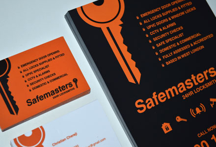
Initially we were approached only to design personal business cards and advertising material for the new start-up. We discussed the importance of maintaining a clear brand and the value it offers small, local businesses that have a large customer base. With much of the initial design in place it was decided a simple logo, with a bold colour palette would be eye catching to the West London market it would be catering towards. The name and final design was achieved with this in mind presenting a brand which we felt would be transferable as the business grows.
Noble Ink- Personal Branding and Logo Design
Graeme Noble, with his company Noble Ink, was the first client to approach our design team. The idea behind the company was to provide a new focus for his wife Tania after the closure of her furniture business. To then become an umbrella operation for any future family enterprise. When creating the company name Ink was chosen instead of Inc. (abbr.) as a play on the two words. It gave us a clear direction when developing the logo. In addition to the stylised font it was decided the feather brought a certain elegance to the final design which had not been expressed in earlier concepts. It was considered strong enough to stand alone as a logo, not only representing Tania’s love of feathers but also the visual link between ink and the quill. The elegance and delicacy of the feather was further complimented by the selection of a deep, luxurious purple colour.
Although it had no bearing on the original design concept, the shape and aspect of the quill also had a subtle nod in the direction of the logo for a transport business, Kiwi Couriers, which Graeme Noble is also involved in.

